Shirred eggs

Ramekins aren't just for advanced culinary creations like soufflés and crème brûlées. But as with mathematical proofs, some of the most elegant foods you can prepare in a ramekin are the simplest.

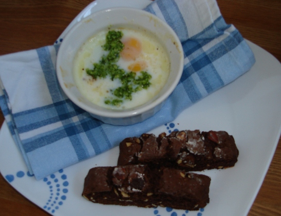
Shirred eggs with pesto sauce, spiced chocolate biscotti

Enter the shirred egg. Don't be intimidated by the word "shirred"; it's just the special term for a baked egg. The yolk is as delightfully runny as in a poached egg, but it's easier than scrambling. And because the egg isn't fried, it's healthier.

I basically treat shirred eggs just as I'd treat poached eggs. The whites even have a similar fluffy texture, though they aren't as thin. In my kitchen, poached eggs usually imply that they are topped with pesto sauce, perhaps mixed with a touch of cream, and shirred eggs aren't much different - I just leave the toast or english muffin to the side. Or in the case of today's breakfast, I omitted the toast for two homemade spiced chocolate biscotti to accompany my cappuccino.

Shirred eggs

Ingredients:

  • 2 large eggs
  • 1 tablespoon milk
  • Butter
  • Salt
  • Pepper

Preparation:

  1. Preheat oven to 325°F.
  2. Lightly butter a small (approximately 4 ounce) ramekin. Crack the eggs into the ramekin and top with the milk. If you want, you can top the eggs with a small amount of butter. Season lightly with salt and pepper.
  3. Bake until the egg whites are opaque and set (15 to 20 minutes); the yolks will still be slightly wobbly. Serve immediately.

Yields one serving.

Sometimes, the outside is inside

Just a few pages off the bustling infinite corridor, there's another hallway, but unlike the infinite, it has four-story-high glass ceilings, my favorite piece favorite piece from the Percent-for-Art Program, and no traffic.

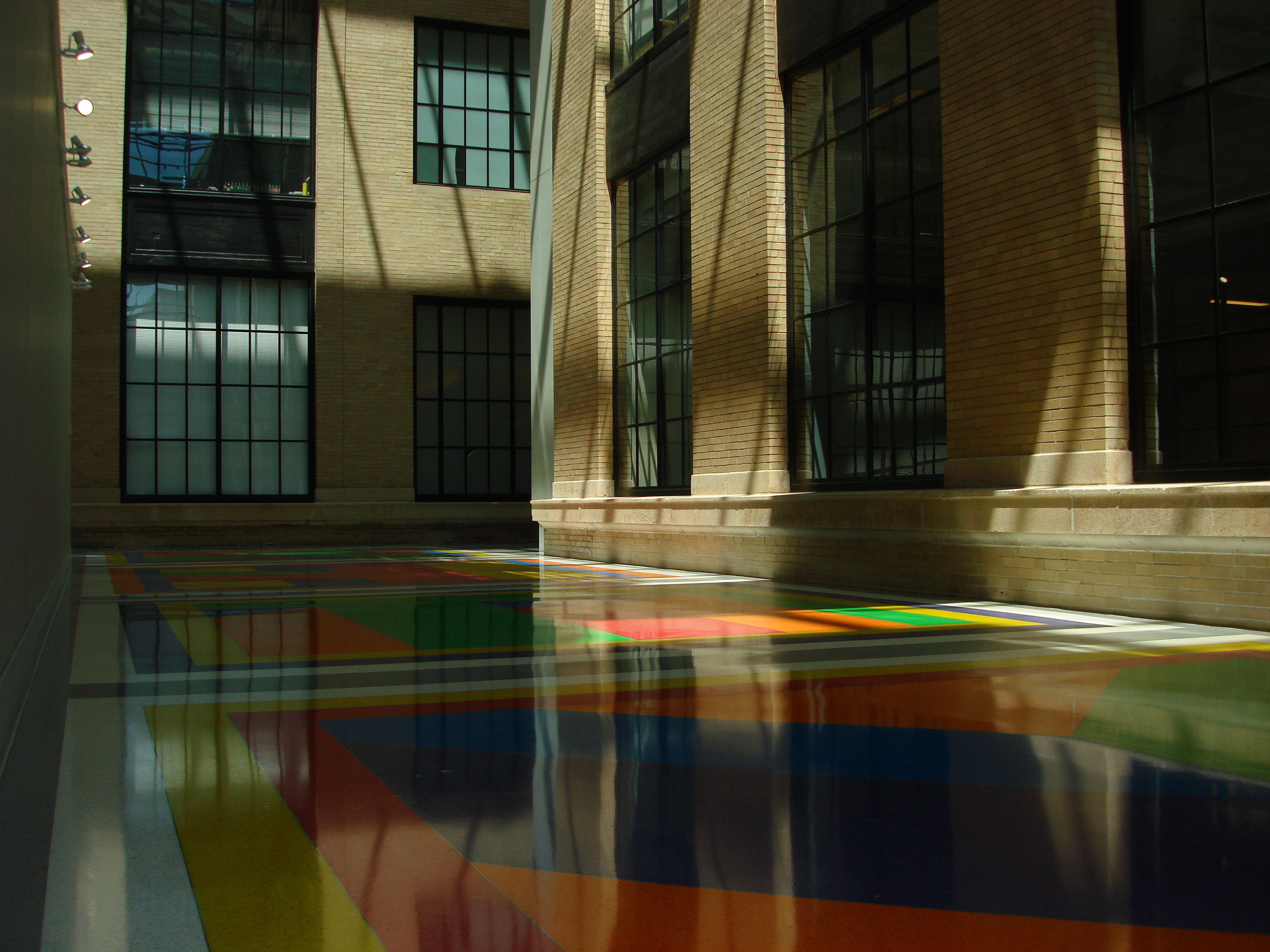
Building 6c's colorful, sunny hallways

The exterior of building 6C fascinates me. The corridor with the colorful floors of Sol LeWitt's Bars of Color Within Squares connects the outsides of 4, 6, 6C, and 8, and in most places, the hallway would actually just be outside. The ledges of the first floor windows provide convenient benches. The greenhouse-styled ceiling lets in more than enough light for reading, while the pathways above create shaded spots. And when it's too hot or too cold and there aren't clouds in the sky, it's bright, warm, sunny, and just right.

'First' thoughts on git

I suppose it's more than a slight bit incorrect to state that these are my first thoughts on git; I've certainly already been exposed to git in a variety of ways. I'd always been told that my love of graph theory would convert me over to this different type of version control.

I more or less decided to look into git on a set of whims, yet I was really persuaded to go to the "dark side" because I was strongly encouraged (read: required) to understand the back-end model instead of just memorize a handful of commands (like with SVN). I'd attempt to do the merits of the consequences of git's back-end model justice, but instead, I'll point you to a far more experienced git user's blog post.

My first steps to really learning git was to look at a handful of resources:

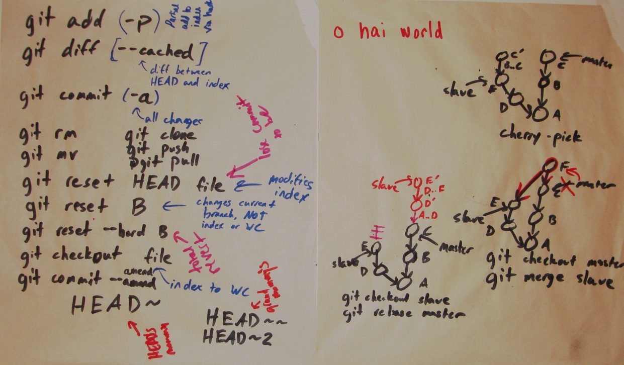
After an hour or so of reading, my friend Evan and I talked through a bunch of the basic commands briefly and some of the more interesting commands in greater depth. I took notes on easel paper for the basic commands, and we worked through diagrams for cherry-pick, merge, and rebase:

Notes and diagrams from our conversations on git commands

I got fairly excited when I guessed that rebase essentially applies a series of cherry-pick calls to a branch.

I decided to start using git much more frequently for my academic projects. I really like the control that my understanding of the back-end model provides, and that control in and of itself is a sufficient reason to consider switching to git. I'll also argue that learning the back-end model is a fun enough exercise to want to switch.

A very MIT signals problem

I've always found signals and systems interesting, as it is one of the most power tools out there. Signals and systems can be used to describe many different problems because it is simply an abstraction which describes a physical, mathematical, or computational system by the way it transforms an input signal into an output signal. It's often studied by electrical engineers because it has many direct applications to signal processing and communication systems, but there are lots of applications in other fields.

The signals and systems intro class at MIT, 6.003, is one of the most dreaded and disliked Course 6 classes. The class used to be required for all Course 6-ers, both EE and CS majors, but now that the EE/CS department has switched to a new curriculum, it's only required for double E's. It's a bit unclear where I fall in the Course 6 spectrum, but most of my friends think I'm crazy for having enjoyed 003.

I took 003 in Fall 2009 with Professor Denny Freeman. His approach deviated from the usual approach to the class by

  1. reordering the topics so that Laplace transforms were taught before Fourier transforms and
  2. introducing the concept of "Engineering Design Problems."

The "Engineering Design Problems," or EDPs for short, aimed to show 003 students some tangible applications of the material, and they were open-ended questions which typically required some amount of programming. For most people, these problems made them a bit more excited about signals and systems, but for me, this was all about getting excited about writing little pieces of code.

The most "MIT" EDP was assigned near the end of term:

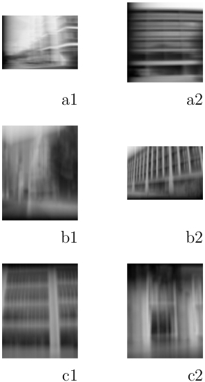
The following images have been blurred. Figure out a way to sharpen each image to identify the following buildings:

Blurred Buildings assigned

You might be able to guess what some of those buildings are without even seeing the larger images the course staff included in the assignment. (b1 certainly is the most distinctive.)

Of course, there are many ways to blur an image, but looking at this from the simplest 6.003 perspective, it's most likely that either the rows or columns were blurred by a system with a single pole. After all, Denny Freeman is a big fan of Occam's Razor. Running with this assumption, such a system would have a system function with the following form:

H_{blur}(z)=\frac{1-p}{1-pz^{-1}},

where p is the system's only pole. This system would be stable if |p|<1. More importantly, if this system were a low-pass filter, i.e. if 0<p<1, it would blur the image.

You can deblur a system blurred by a single pole by applying a system with a single zero:

H_{deblur}(z)=\frac{1-pz^{-1}}{1-p},

where p is this system's only zero and has the same value as the pole in H_{blur}(z).

Since we will want to write code to deblur the image, we will want to get the difference equation corresponding to H_{deblur}(z) to apply to the rows or columns of the blurred images. The corresponding difference equation is:

y_{deblur}[n]=\frac{1}{1-p}(x[n]-px[n-1]).

Now that we may have figured out what's going on generally, let's look closely at image a1:

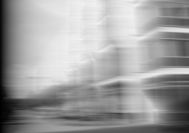
Blurred Building a1

The blurring in image a1 looks to be primarly horizontal, which means rows of the image's pixels would have been passed through the low-pass filter. To deblur this image, we should try to pass rows of pixels through the deblurring different equation, y_{deblur}[n]. The rows were processed either casually or anti-causally, i.e. left to right or right to left, respectively.

At this point, we really just have to dive into writing some code. The first deblurring code I wrote was a Python script to deblur a blurred_image from left to right with a pole p and save it to deblurred_image:

import Image
import os

def deblur_left2right(blurred_image, deblurred_image, p):
    original = Image.open(blurred_image)
    new_image = Image.new('L',[original.size[0],original.size[1]],0)
    original_pixels = original.load()
    new_pixels = new_image.load()

    for j in range(original.size[1]):
        new_pixels[0,j] = original_pixels[0,j]
        for i in range(original.size[0])[1:]:
            new_pixels[i,j] = (original_pixels[i,j]-p*original_pixels[i-1,j])/(1-p)

    new_image.save(deblurred_image)

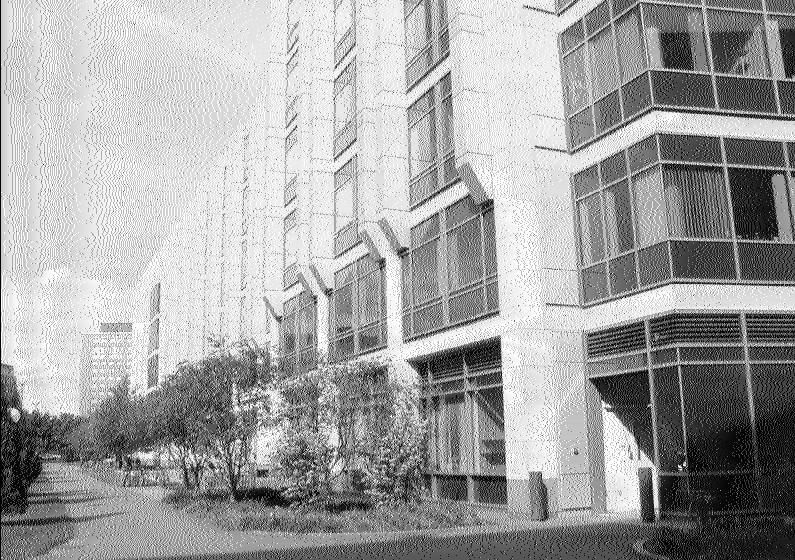
After playing with different values for p, it was apparent that images a1 and a2 were blurred from left to right with a pole at 0.985, so deblurring them with a system with a zero at 0.985 returned the original images. Here is the unblurred version of a1:

Unblurred Building a1

As you can see, a1 is building 68.

The buildings in the second row, b1 and b2, had their columns blurred from bottom to top with a pole at 0.985, and the third row, c1 and c2, had their columns blurred from top to bottom with a pole at 0.985. You can change the for loops in the Python script to deblur in other directions. I encourage you to also see what happens when you change the value of p.

Even with "cute" EDPs like this one, 003 last fall was still all about grungy math - signals and systems often are. However, students who hadn't decided that the class would be too terrible before even stepping into 34-101 for the first lecture seemed to enjoy playing with some of the more tangible applications of signals and systems and got a lot out of the class. Hopefully, more people can come to appreciate this class in its own right, and maybe fewer people will shy away from being an EE because they fear 003.

My love-hate relationship with typeface rendering in Ubuntu

We take good, er at least reasonable, typography for granted all the time. This is especially true when it comes to personal computers because with Microsoft Windows and Mac OS X - upwards of 98 percent of the market - you get characters that are easy on the eye right out of the box.

Let's look at font rendering on Ubuntu. At first glance, it's disappointing. Every time I reinstall Ubuntu, I am bothered of the oddly tall lowercase "l" which is featured on one of the pages on ubuntu.com:
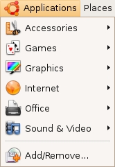
Ubuntu Applications Menu from ubuntu.com

I simply don't find this font rendering as pleasing to the eyes as font rendering on Windows or OS X.

Font Rendering GUI

Fortunately, even though fonts aren't as pretty right out of the box in Ubuntu, you can control your font rendering through an easy-to-locate GUI (System → Preferences → Appearance):
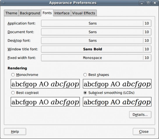
Appearance Preferences: Fonts

A lot of Ubuntu users don't seem to care that much about their font and can be satisfied by playing with the four options in this level of the GUI. The problem is that, unlike the average computer user, many people who switch over to Ubuntu are looking for something other than an operating system that works well when you surf the web or check your email. For those who want an OS that "just works," these four options may not be enough. As someone who (ignorantly?) grew up on Windows, I just couldn't find an option I liked from these four.

Beyond the fact that you don't have quite enough options, it's a lot easier to talk about fonts in terms of hinting, anti-aliasing (analogous to the Ubuntu option for grayscale smoothing), and subpixel smoothing/rendering. These three properties map directly to an aspect of how fonts are rendered on your screen.

Ubuntu's GUI-controlled font rendering options can be described in terms of these properties:

  • Monochrome: no smoothing, full hinting
  • Best Shapes: grayscale smoothing, medium hinting
  • Best Contrast: grayscale smoothing, full hinting
  • Subpixel Smoothing (LCDs): subpixel smoothing, slight hinting

I suggest having Firefox open with a word-heavy webpage you frequent, selecting your favorite of the four options, and then clicking the "Details..." button in the Appearance Preferences GUI, so that you can see what happens when you play around with these properties:
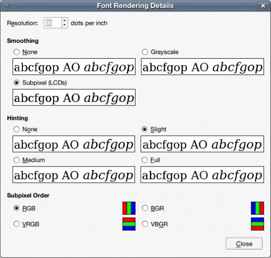
Font Rendering Details

Trial and error really is the best way to figure out what you like. (Note: Changing subpixel order isn't important unless your LCD screen has subpixels in a different order than RGB.) You should make sure to look at a lot of different sized fonts, and if you generally see a variety of fonts, look at a variety of fonts, too.

If you're anything like me, you might be curious as to what each of these three properties actually does and why. I won't include pictures of fonts that are rendered with different properties because different people use differently sized and styled fonts, and these differences are affected somewhat differently by the same rendering options.

Hinting

Hinting, also known as instructing, adjusts the display of a font's outline so that it lines up with a rasterized grid through mathematical instructions. The more hinting, the "crisper" your font appears at small sizes because hinting instructors seek to preserving detail without risking the outline's clarity when rendering fonts. According to the TrueType Reference Manual:

A quality outline font is one that provides legibility at small sizes on low resolution devices and fidelity to the original design at large sizes and on high resolution devices. Chance effects due to interactions between the outline shape and the placement of the grid should be minimized.

I generally do not like hinting, but I know a lot of people who strongly swear by full hinting for all font sizes.

Anti-aliasing

In digital signal processing, the choice of sampling period, T, directly affects the ability to fully reconstruct the original signal. The sampling frequency is defined as \omega_s=\frac{2\pi}{T}, and if there are frequency components \omega present in the original signal such that \omega >\frac{\omega_s}{2}, artifacts from the higher frequency components of the original signal distort the version reconstructed from the sampling process.

Anti-aliasing is a technique that minimizes the affects of the distortion caused by representing a signal at a lower resolution through sampling. This technique removes the high frequency signal components, \omega >\frac{\omega_s}{2}, which would cause aliasing before sampling.

Personally, I like using anti-aliasing for most text. This isn't in the GUI, so you'll need to update your .fonts.conf.

Subpixel Smoothing

Subpixel smoothing uses the fact that each pixel on a color LCD screen is actually composed of individual red, green, and blue subpixel stripes to smooth text with greater detail. If you're still using a CRT monitor, subpixel smoothing probably won't improve your font rendering. Whether or not you enable this property is mostly a matter of personal preference, as it also causes colored pixels to appear around text.

If you do choose to use subpixel smoothing, odds are the default subpixel order (RGB) is what your LCD screen uses; you probably shouldn't change this unless your screen uses a different arrangement.

I prefer not to use subpixel smoothing.

~/.fonts.conf

While you are able to toggle these variables through the Font Rendering Details GUI, you can get a lot more control over your typeface rendering if you use the .fonts.conf XML file in your home directory.

Here is an example of a .fonts.conf file which turns off hinting and subpixel smoothing but enables antialiasing:

<?xml version="1.0"?>
<!DOCTYPE fontconfig SYSTEM "fonts.dtd">
<fontconfig>
 <!-- Turn on antialiasing -->
 <match target="font" >
  <edit mode="assign" name="antialias" >
   <bool>true</bool>
  </edit>
 </match>
 <!-- Turn off hinting -->
 <match target="font" >
  <edit mode="assign" name="autohint" >
   <bool>true</bool>
  </edit>
 </match>
 <match target="font" >
  <edit mode="assign" name="hinting" >
   <bool>false</bool>
  </edit>
 </match>
 <match target="font" >
  <edit mode="assign" name="hintstyle" >
   <const>hintnone</const>
  </edit>
 </match>
 <!-- Turn off subpixel rendering -->
 <match target="font" >
  <edit mode="assign" name="rgba" >
   <const>none</const>
  </edit>
 </match>
</fontconfig>

The above XML handles the lion's share of the work my .fonts.conf file deals with.

While you can control the properties mentioned above through this file instead of the GUI, the real perk of the .fonts.conf file is that you can specify different properties for different font sizes and styles. For example, I prefer hinting without anti-aliasing for very small fonts, and I can control this through the .fonts.conf file.

You can certainly look at a complete manual for .fonts.conf files, but experimenting with parts of other people's .fonts.conf files is also useful because there isn't a right answer to questions of personal preference. Unfortunately, tweaking font rendering to your complete satisfaction often takes a non-trivial amount of time.